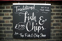
A recent project i did for Ted Baker, we chose the theme of a British Fish and Chip shop, the idea was to keep it irreverently British and humerous therefore we chose this traditional tea time theme. The font we selected for our design was chosen due to its visual similarities to Fish and Chip shop signs that arose in our research.
The two fonts we thought symbolised the chalkboard menu used in 'Fish and Chip shops' were Lobster and Reklame script due to there hand rendered script qualities which are based on the lettering created by chalk pens or sticks used on Black boards. Originally these style of fonts were hand rendered for menu purposes but now we can digitally re-master them for use on our own designs to symbolise their original idea. It makes our idea appear more real and traditional and increases the meaning and understanding.


No comments:
Post a Comment